Critiques and Suggestions
Original Visualization
| # | Critique | Suggestion |
|---|---|---|
| Clarity_ | ||
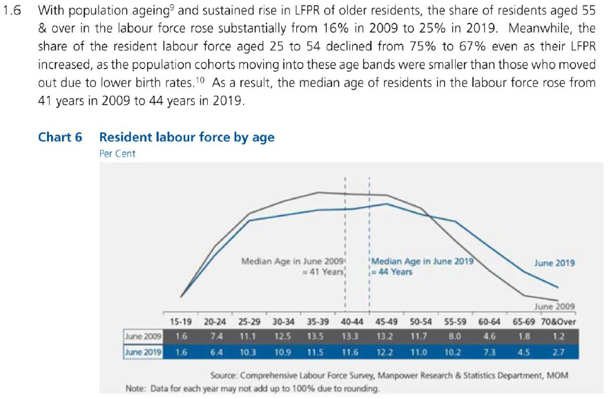
| 1 | The text is comparing the sum of share of resident labour force of multiple age groups between 2009 and 2019 but those numbers are not highlighted and requires the reader to do the calculations using the data from the table | Use a separate chart for the comparison between 2 years |
| 2 | The median age lines are using the table’s header as a continuous axis while the line chart is using it as a categorical axis, hence the intersections of the lines are incorrectly representing the labour force participation rate of age 41 and 44 in 2009 and 2019, respectively. The text is also not clear if it’s referring to the median age of the labour force or the median age of the population | The median lines should be removed. Some simple annotation would suffice to state the median age in 2009 and 2019 |
| 3 | Title does not represent the message the data visualization tries to convey | Rewrite the title to better describe the data visualization |
| 4 | The line graph does not have a Y-axis | Add a Y-axis and clearly label the ticks with percentage |
| Aesthetic | ||
| 1 | The background color being grey serves no purpose and makes the 2 colors in the visualization less contrasting. These choice of colors would also be indistinguishable if the report is not color printed | Use a white background with a colored border around the visualization if needed |
| 2 | Table headers are used as the x-axis of the table which makes the line graph on top looks out of place | Use a separate chart instead |
| 3 | “70&Over” is too long for the table cell, making it look crammed | “70+” would be more space efficient while still able to convey the meaning |
Proposed Design
How-to Guide
Butterfly Chart
- Copy the data into a new Excel worksheet as the original file has a lot of formatting.
- Open Tableau and connect to the data in the new Excel worksheet.
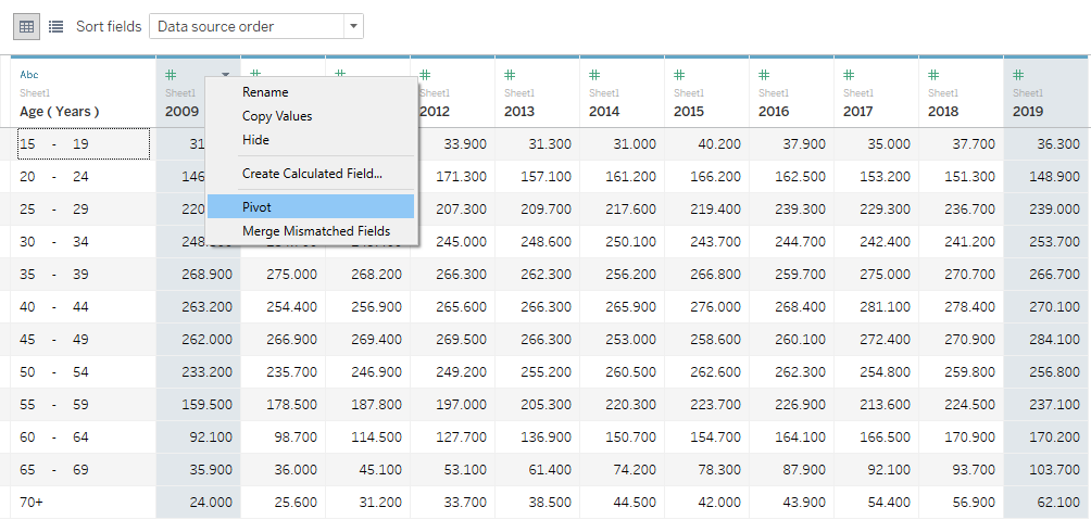
- Hold Ctrl and click on the columns 2009 and 2019.
- Right-click on one of the selected columns and select Pivot.
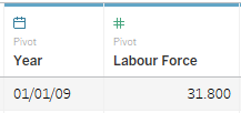
- Rename the pivoted columns to Year and Labour Force and change the data type of column Year column to Date.
- Go to Sheet1 and rename the sheet to 2009.
- Drag-and-drop Year and Labour Force to the Columns card and Age to the Rows card.
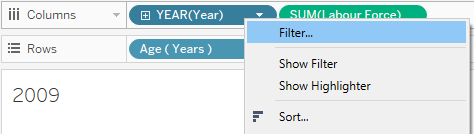
- Right-click on the Year pill to select Filter.
- Un-check 2019 from the list and select OK.
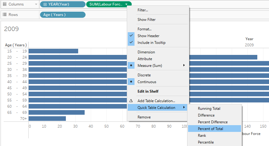
- Right-click on the Labour Force pill and select Quick Table Calculation > Percentage of Total.
- Hold Ctrl, drag-and-drop the Labour Force pill from the Columns card to Color in the Marks card.
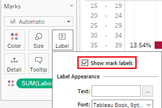
- In the Marks card, click on Label and select Show marks labels.
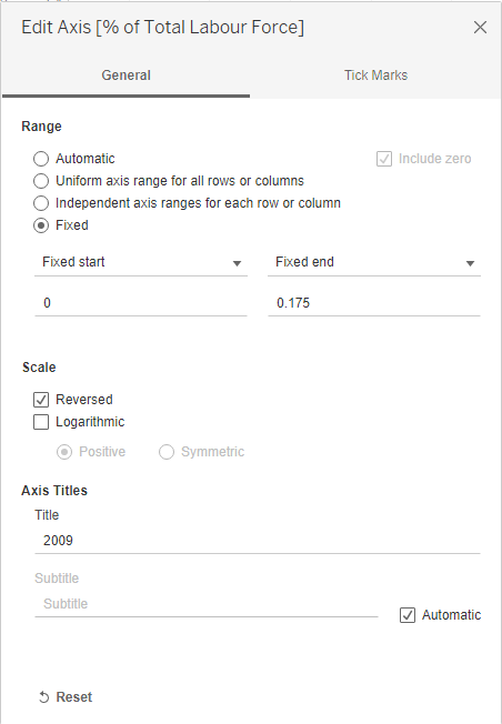
- Right-click on the X-axis and select Edit Axis:
- In the Range section, select Fixed and set the start and end values to 0 and 0.175, respectively.
- In the Scale section, select Reversed.
- Set the title of the axis to 2009.
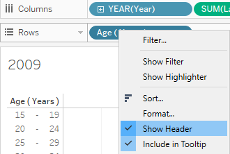
- Right-click on the Age (Years) pill and un-check Show Header.
- Right-click on the Year pill and un-check Show Header.
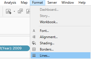
- From the Toolbar, select Format > Lines:
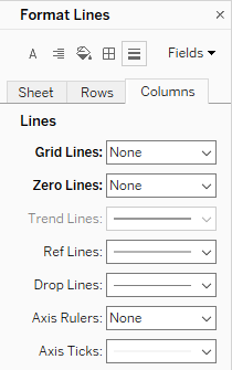
- In the Columns tab, set Grid Lines to None.
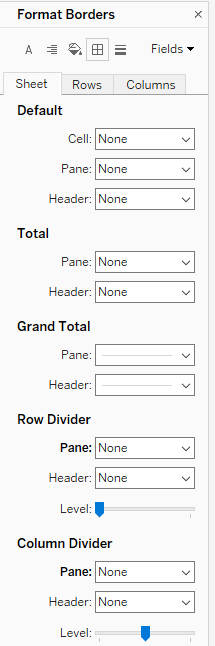
- Switch to the Format Borders tool, under the Sheet tab.
- Set Row Divider Pane to None and Column Divider Pane to None.
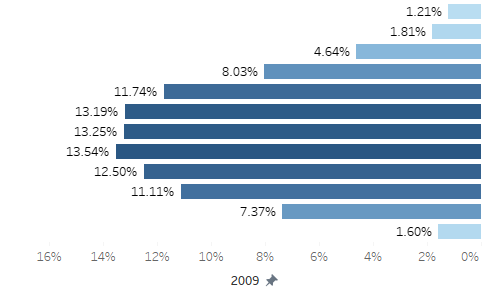
- The bar chart should looks as below
- Duplicate the 2009 sheet and rename it 2019.
- Right-click on the Year pill and select Edit Filter then un-check 2009 and check 2019.
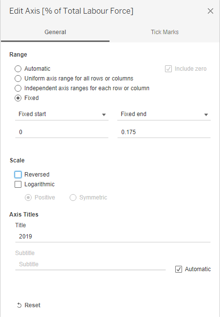
- Right-click on the X-axis and select Edit Axis:
- Un-check Reversed.
- Rename the axis’ title to 2019.
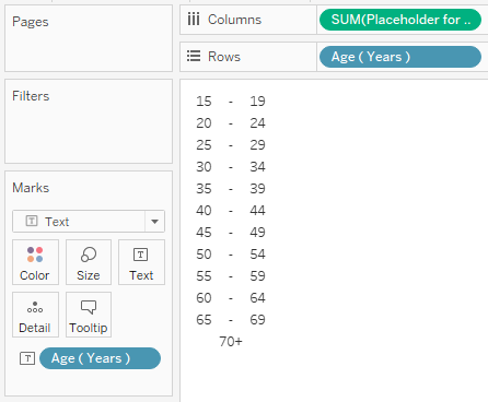
- Create a new sheet and name it Year.
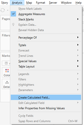
- From the Toolbar, select Analysis > Create Calculated Field:
- Name the calculated field Placeholder for Age.
- Enter 0 as the formula.
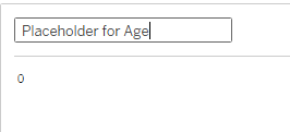
- Drag-and-drop the Placeholder for Age field to the Columns card.
- Drag-and-drop the Age (Years) field to the Rows card.
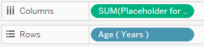
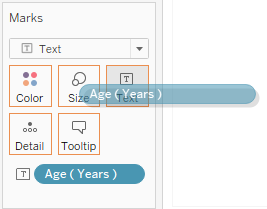
- Change the Marks type to Text.
- Drag-and-drop the Age (Years) field to Text in the Marks card.
- Right-click on both the X-axis and Y-axis and un-check Show Header to hide the axis.
- Remove the sheet title.
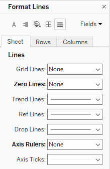
- From the Toolbar, select Format > Lines:
- On the Sheet tab, set Axis Rulers to None.
- On the Sheet tab, set Zero Lines to None.
- On the Columns tab, set Grid Lines to None.
- Reduce the width of the “chart” as much as possible.
- Create a new Dashboard.
- Arrange the 3 previous created sheets in the Dashboard to achieve the Butterfly Chart.
Stacked Bar Chart
- Create a new Sheet called Comparison.
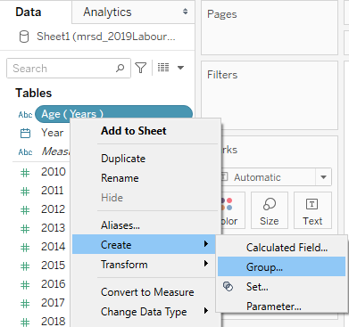
- In the Data pane, right-click on Age (Years) and select Create > Group:
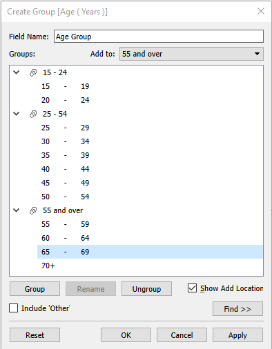
- Set the Field Name to Age Group.
- Use Shift to select and group all the age groups from 15 to 24 into a group named 15 - 24.
- Group all the age groups from 25 to 54 into a group named 25 - 54.
- Group all rest of the age groups into a group named 55 and over.
- Drag-and-drop Year into the Rows card and Labour Force into the Columns card.
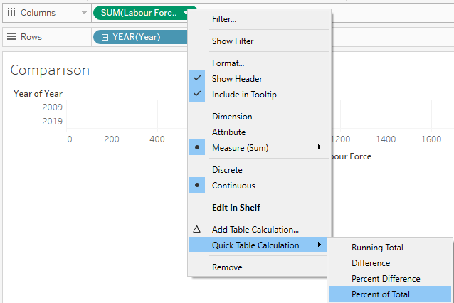
- Right-click on the Labour Force pill and select Quick Table Calculation > Percentage of Total.
- Right-click on the Labour Force pill and select Compute Using > Table (across).
- Change the Marks type to Bar.
- Drag-and-drop the Age Group group into Color in the Marks card.
- Drag-and-drop the Age Group group into Detail in the Marks card.
- Right-click on the Age Group pill in the Marks card and select Sort. Choose Descending.
- Set the desired colors for the Age Group.
- Remove the title and field labels of Year.
- Arrange the new bar chart into the final dashboard.
- Finally, add observations and annotation. Voila!
Final Dashboard
Insights
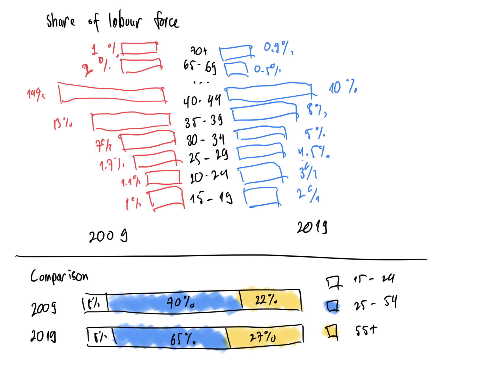
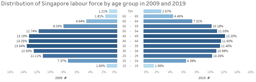
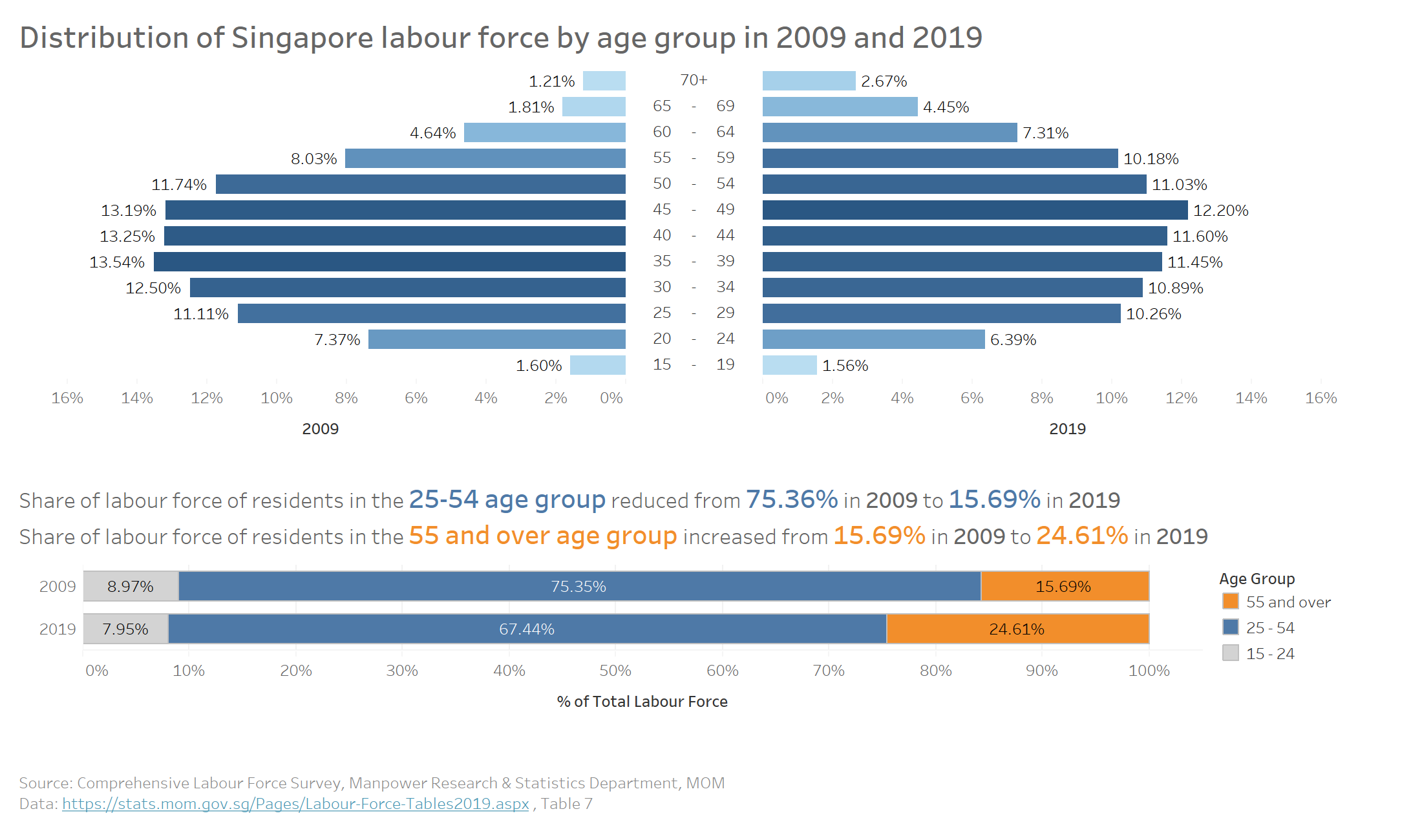
- Singapore seems to have an aging workforce as the distribution of the labour force is leaning more towards the older age group in 2019 compare to 2009.
- The distribution of all the age groups from 60 and above has the largest increase in 2019 relative to 2009, indicating that elder people may still have to work instead of retiring.
- The age group which held the largest share in 2009 is 35-39, however, by 2019, the age group with the biggest share has shifted to age group 45-49.